
Welcome to the inaugural entry for the new Visual Analytics blog! Although I am sure you have been looking around and reading about this app already, I want use this opportunity to go into how the idea for Visual Analytics came about, the purpose of the application, and the vision we have for the future.
The Initial Idea
The initial idea for the Visual Analytics application was conceived not long after I started my blog - brettromero.com - and installed a Google Analytics WordPress plugin to track usage of the blog. Initially, I loved looking at all the statistics that were produced, and although my blog traffic was (and let's face it, still is) pretty minimal, I loved seeing how different things could influence the traffic. How the traffic would spike when I posted to social media, how links to my site from more popular websites would generate ongoing traffic, and how, after some time, it would also tend to improve my organic search traffic. It was all super interesting to me and I could spend hours digging through the tables to better understand what was going on.
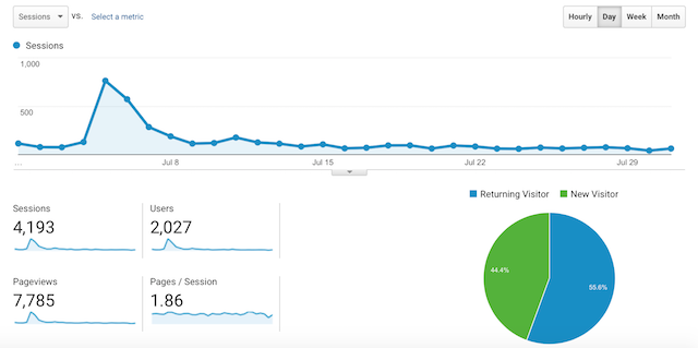
A tweet from Kaggle mentioning one of my articles caused a big spike in traffic in July 2016
After a while though, what I found was that checking my analytics stats had become a bit of a chore, and a little unsatisfying. The key things that I wanted to check required me to dig down through the same menus every day, or every other day. I also found it difficult to understand which paths users were taking through the site, or if I had a sudden unexplained burst of traffic, working out where it had come from. In addition, if I wanted more detailed organic search statistics, I had to go a different website completely.
None of this should be taken as criticism of Google Analytics. Google Analytics has to cater to a huge range of audiences and, as they should, they have done that by creating a very flexible and highly customizable tool. However, my belief was that for basic users who want to look at a smaller set of specific things they find relevant, or perhaps even users who do not really know what they should be looking at, maybe there is a better way to present this information.
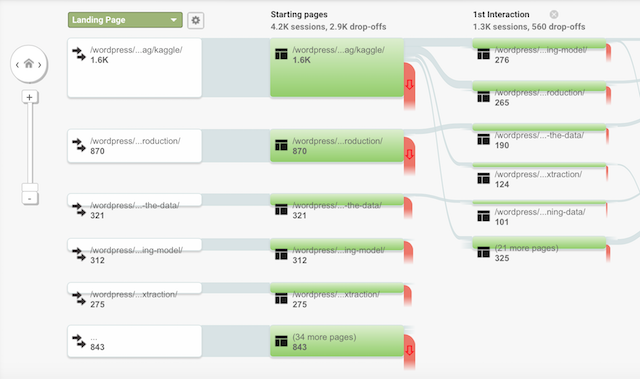
The famous Google Behavior Flow visualization can make it difficult to see the bigger picture
The Purpose
Around this time, I was really getting into creating interactive visualizations, and so, given I'd just come off a long term contract, I decided to spend some time trying to build a web app that would use the Google Analytics API to get a user's data, and present it to them in a simpler and more visually interesting way. The initial visualization I developed was the Userflow visualization, but I soon added several others to cover other areas of interest. After around 6 months of on and off work, the result is what you see here today - the first release of Visual Analytics.
Overall, everything in Visual Analytics has been designed to allow users to have a concise view of the key statistics from their Google Analytics properties. In other words, we have selected the pieces of information that we believe most website owners will be interested in, and presented it in a way that we believe is more intuitive and easier to understand by focussing on making use of interactive visualizations.
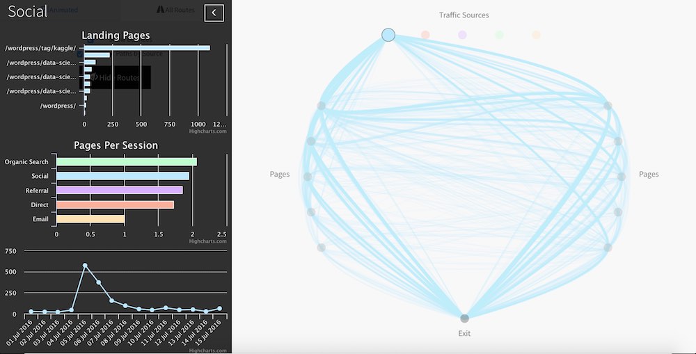
Our version of the behavior flow visualization, hopefully making it easier to understand how users are moving around your website
Currently the app has five different views that can be looked at and interacted with, with each one covering different areas of interest in your analytics data.
The Future
Despite the work to date, we have big plans to develop new features for Visual Analytics. There are at least a couple of areas we are planning to add completely new visualizations and dashboards, as well as well adding more options, flexibility and customizability to our existing visualizations. So keep an eye on this section for the latest news on what is happening to the app, including bug fixes, new features, changes to layouts/design, and so on. Hopefully there will be a lot to report on over the coming months!