Last Updated: 12 December 2017
Google Analytics and the Google Analytics dashboard are powerful tools with high levels of customization and an almost unlimited ability to segment and filter your data. So why should you use Visual Analytics? Let's take a look at some of the primary reasons.
1. Focussing on the important information
The volume of options and customization available in Google Analytics, and many applications built on top of Google Analytics, can be hugely beneficial - if you know what you are looking for. However, for many people, they are not sure where to start, do not want to spend the time building custom dashboards, or simply want a quick way to view the key stats from their website without having to dig around.
This is where Visual Analytics comes in. Every dashboard and visualization in this application has been designed to present you with the key information you need to know, in a simple and easy to digest way. This starts with the first dashboard you will see when you log in and select a view.
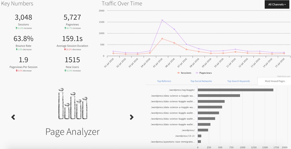
Your primary dashboard in Visual Analytics.
In one page, you are given the following pieces of information for the selected time period:
- Six summary statistics (sessions, pageviews, bounce rate, average session duration, pageviews per session and new users)
- How your traffic changed over the course of the selected period - filterable by channel
- Your top referrers
- Your top social networks
- Your top keywords for Organic search
- Your most viewed pages
To access all this information from your Google Analytics dashboard, you would need to look at a minimum of five different pages, and of course you would need to know how to get to them all.
For each dashboard and visualization we have created, the same approach has been taken, presenting you with the most important numbers in an accessible way.
2. Powerful cross-referencing
One of the biggest benefits of Visual Analytics is not just that dashboards are designed to be bright, clean and easy to read, but that they are interactive. Clicking on one element will filter the dashboard accordingly, allowing you to quickly identify underlying trends and patterns that otherwise might have gone undiscovered.
For example, let's take a look at the 'A Day in Detail' dashboard. This dashboard is designed to allow us to quickly understand what happened on our website on a single day (the typical use case would be to analyze what happened yesterday).
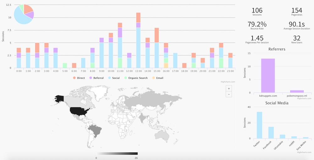
Initially, we can make several interesting observations:
- A lot of traffic is coming from social media, primarily Twitter
- Most of the traffic is from the US, and
- We are getting a bit of referral traffic from KD Nuggets.
However, we might look at our social media traffic sources and ask what is VKontakte? What are those users doing?
By clicking on that column in the bar chart, we can filter the page for users that came from that source.
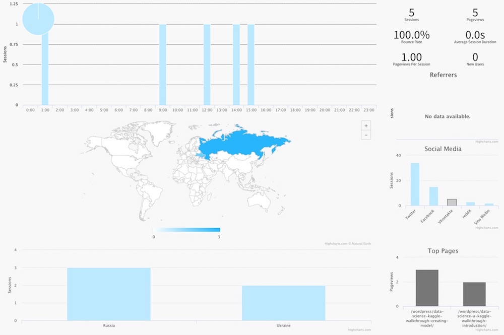
Now with this filtered view we can see several new pieces of information. We can see what time of the day these views occurred, where these users came from (Russia and Ukraine), which pages these users viewed (two pieces from the 6-part Kaggle Walkthrough) and that they were all bounces (bounce rate 100%).
This level of cross-referencing is something that is close to impossible to achieve using your Google Analytics dashboard.
3. Explore and understand your Google Search Console data
Often, one of the more interesting data points for Google Analytics users and website owners is which keywords users are searching to find your website using a search engine (e.g. Google). Many of you may have noticed that Google Analytics does not provide you with a lot of data on these search keywords, with almost all your search traffic having the keyword listed as "(not provided)". This removal of search keywords is primarily done to protect the privacy of people using Google search, but that does not really help you to understand your search traffic.
One way you can get more data on what people are searching to find your website is to use the Google Search Console. For those that have not done so, this does need to be setup separately from Google Analytics, but is super easy to do so if you already have Google Analytics on your website.
The issue, for those familiar with the Google Search Console interface, is that it is very limited in what you can do. Here again is where Visual Analytics shines. Using the Visual Analytics Organic Search dashboard, you can quickly and easily cross-reference search terms with the countries the users came from and with the pages users found. For example, below is a screen grab from the Organic Search dashboard for my blog from mid-November to mid-December.
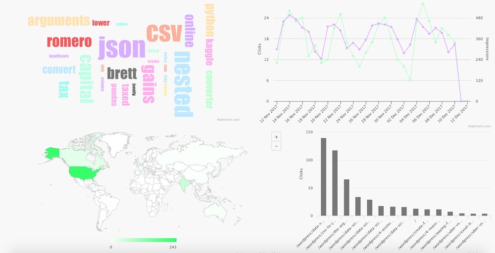
Again, even from this unfiltered view we get several important pieces of information. Most of my search traffic is coming from the US and India, it appears that my search traffic is higher during the week than on weekends, and we can see that a lot of my search traffic is coming from people searching four broad topics:
- My name - Brett, Romero
- How to convert CSV to JSON - CSV, JSON, nested, converter, convert, online
- Kaggle tutorials and guides - Kaggle, pandas, python
- Arguments for capital gains tax - capital, gains, tax, taxed, arguments, lower
But how does this change if I just want to focus on my search traffic from Canada?
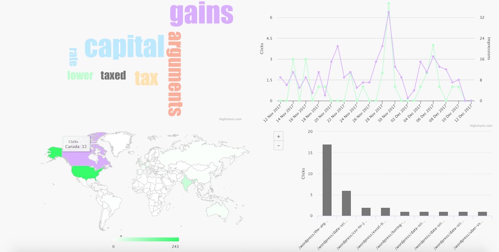
Well, it turns out that at least for the time period we are looking at, Canadians were primarily interested in my capital gains tax article. In fact, of 32 clicks I got from Canada, 17 (53%) were in relation to that one article.
4. A better way to understand how users move through your website
The famous user flow chart in Google Analytics. This particular chart has had numerous user guides written about it to help people understand what it is telling them. But if you need a user guide to understand a chart or visualization, you probably need to rethink your visualization.
At Visual Analytics, one of the first areas we targeted was finding a better way to represent this user flow data, designing a more intuitive and useful visualization that can provide users with an understanding of how users are moving through their website. The result is our own take on user flow:
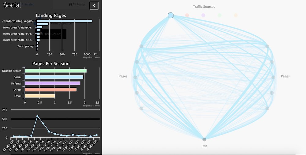
With the option to view the flow of users as an animated flow, or as a static series of lines, we think we have found a more intuitive and interesting way to show you how users are interacting with your website, and help you to identify where they are coming in and dropping off.
Summing up
We have looked at four specific use cases where Visual Analytics may be helpful for you to understand your Google Analytics data, but there are many more. Even during the early days of development, several people identified interesting findings of their own almost immediately. For example, one early tester discovered that a competitor had been viewing their website regularly, something they were not aware of previously. Another identified that there was a missing link to the next article in a series because of the lack of traffic between two pages.
The only question remaining is what will you discover about your traffic?